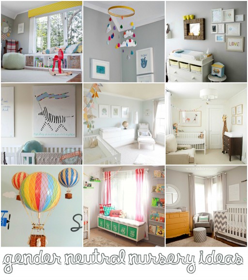
We have rounded up some of our favorite gender neutral nurseries from around the web!
Click “continue reading” below to see the gallery and links:

We have rounded up some of our favorite gender neutral nurseries from around the web!
Click “continue reading” below to see the gallery and links:
I haven’t made one of these in a while! I just finished this “Courtney” painting for my niece for Christmas:
Here is Boo’s original one I made with a Peter Rabbit inspired theme:
They aren’t very hard to make with a little patience because they are done in steps! Here’s a gallery of ones that I’ve made for some ideas and links to other tutorials:

Each and every time I finish one of these little hardboard nursery paintings I laugh a little at how “accidental” they are. I don’t plan them ahead of time…..and I never quite know how they will turn out until I’m about 80% done with them.
I took photos as I painted this recent painting to show my design process. I always start with just a basic light color. It’s easy to paint over and allows me to use the broadest range of colors.
I usually print out a few different mixed fonts and sizes of each name letter and cut them out so I can visualize the layout.
I start with the first and last letter and then fill the center letters in.
I kind of have a theme in my head….like flowers, or animals, or geometric shapes. For this particular painting I was trying to match some floral bedding so I started by sketching what I thought would be the largest objects in the painting: flowers.
Before I even have the rest of the painting planned I’ll start blocking in large areas of color:
I even start outlining letters and detail:
The first thing I noticed about this painting was the large empty space at the top. It needed something large and sweeping…..so I added a bee spelling out “sweet girl.”
To unify the painting, and add some cohesion between the flowers and letters, I added some large circles. I grabbed a few random objects in different sizes to trace:
I then blocked in the circles with colors that would balance the painting. If an orange flower is on one side of the painting, I try to pull some orange to the other side of the painting by painting one of the circles. Light blue circles balance the blue “S” and pink and yellow pull the other colors around the painting:
I then started to add some more detail in the painting using my black paint pen….like the dotted line pattern in the large circles:
Tiny white dot flowers were a good way to subtly fill in some of the background area:
More detail:
The letter “a” looked bare and a little too mustardy so I added some white polka dots. I added a few white polka dots throughout the background as well as some dark pink dot flowers. The last thing I added was a dotted line throughout the painting as if the bee had flown through almost every letter….an easy way to help unify the painting:
Once the painting portion is finished, I placed little butterfly buttons throughout and marked them once I was happy with their location:
The last thing I do is drill and sew the buttons and embellishments on:
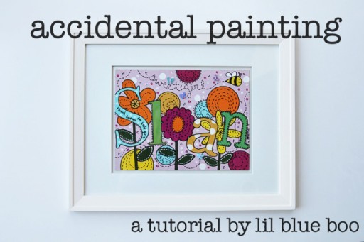
This “accidental” painting is for my new niece Sloan!
I float frame every painting myself…..see my other tutorials to see how to easily frame your own with a professional look!
Don’t even know where to start? Take a look at these:
